Data can be big and messy, but it can also be transformed to tell stories about our world in way that’s more accessible. With tools and data like ours we can also get to truth more quickly together and discover what actors are trying to move us away from collective insight for their own gain. We use data to talk mainly about politics and social impact organizations. Reach out if you would like to discuss how data can help with your organizational or movement storytelling.
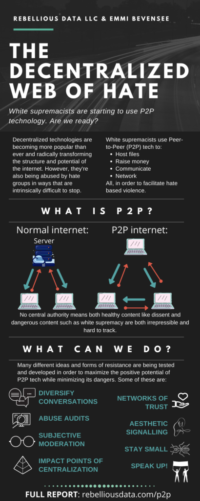
This infographic from our latest report “The Decentralized Web of Hate” talks about what p2p technology is, what its risks are, and how we can mitigate those risks.
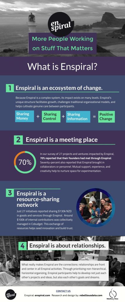
This infographic from our impact evaluation of the Enspiral network, helps tell a simple story about an exceptionally complex social organism.
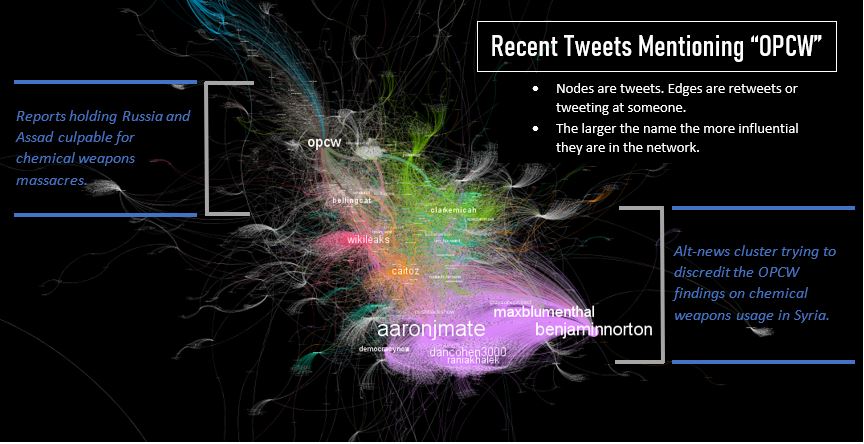
This graphic (found in this article and this tweet) shows how modern information warfare takes place over real issues that impact human lives. This shows the Twitter discourse battle for control of the narrative around chemical weapons usage in Syria with the Organization for the Prohibition of Chemical Weapons battling with Bellingcat against an alternative-news cluster spreading disinformation.
This series, which can be found in short in The Independent and in full on Medium, shows the bot manipulation of the EU parliament elections particularly by the far-right grouping, Movement for a Europe of Nations and Freedom followed closely by the Eurosceptic conservatives.
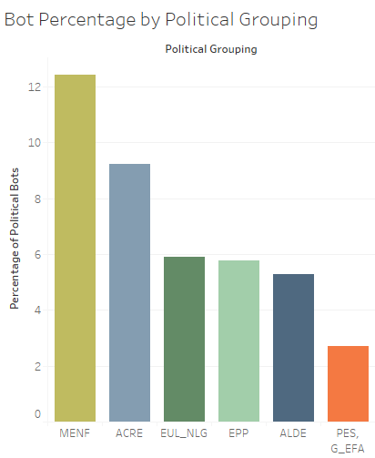
We found that southern Europe was most targeted and that far-right leaders such as Salvini in countries like Italy both excelled at utilizing social media but also benefited from these bots.
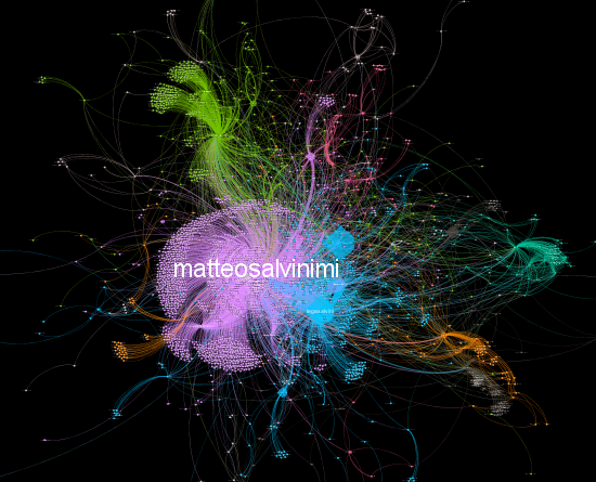
#26maggiovotoLega in which Salvini is disproportionately the most central figure.
This graphic shows the private contracts awarded by Customs and Border Patrol since 2006 and was found in doing research for the Transnational Institute report, “More Than a Wall” about border militarization and corporate pressure.
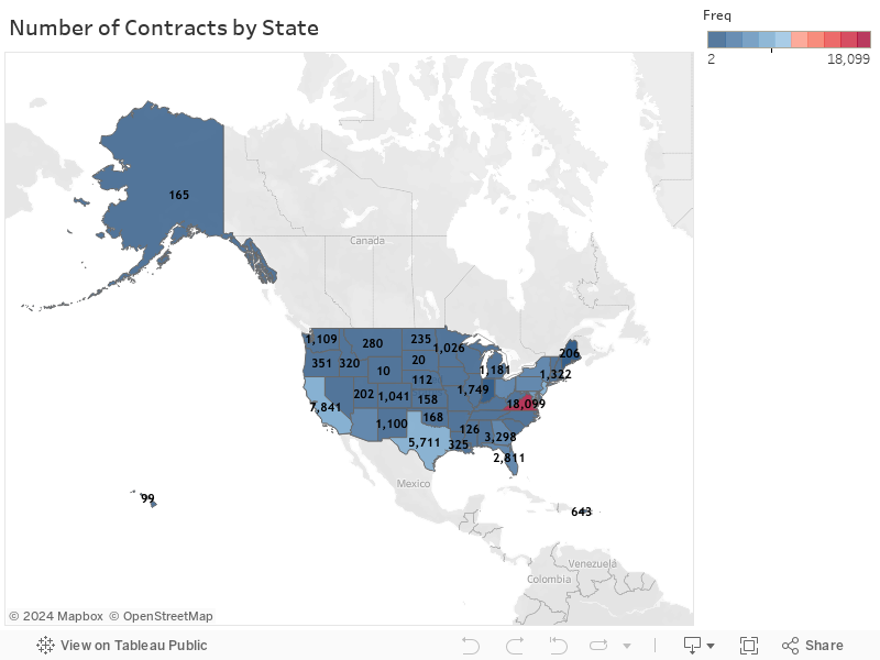
After cleaning extremely messy data on over 60,000 contracts, this graphic shows us where the majority of contracts are being awarded. The majority don’t go to companies located in the borderlands, but rather in Virginia, specifically Arlington, where they have they have the advantages of friendly tax laws and proximity to lobbying in the U.S. capitol. This data was critical in leading our findings that showed how the same companies lobbying for special appropriations, were getting awarded the very same contracts. In short, the same companies that stood to profit were driving and defining the scope of U.S. border militarization policy.
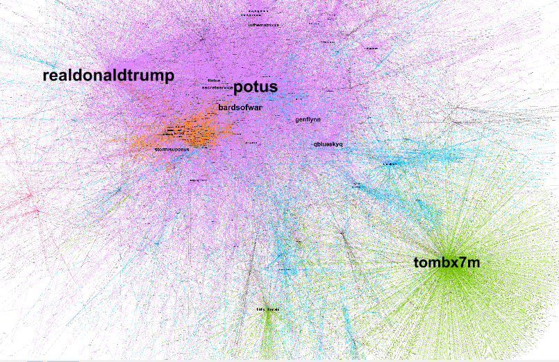
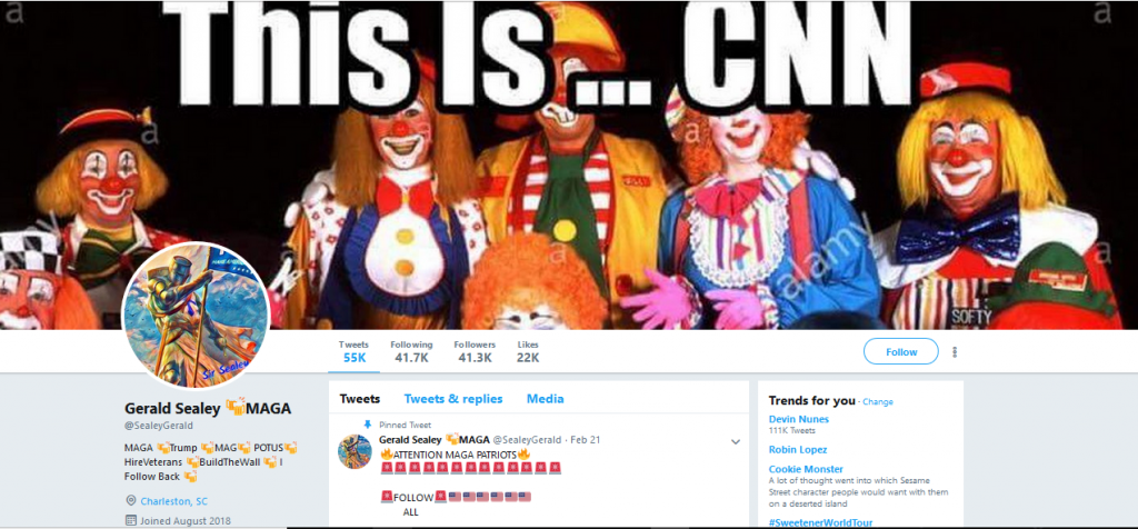
As seen in this Medium article. In my studies of malicious political bots (automated accounts) I was able to identify bots manipulating political discourse under the #MAGA (Make America Great Again) hashtag on Twitter. I utilized the Random Forest algorithm and a combination of API tools to find the most active users of a given hashtag.
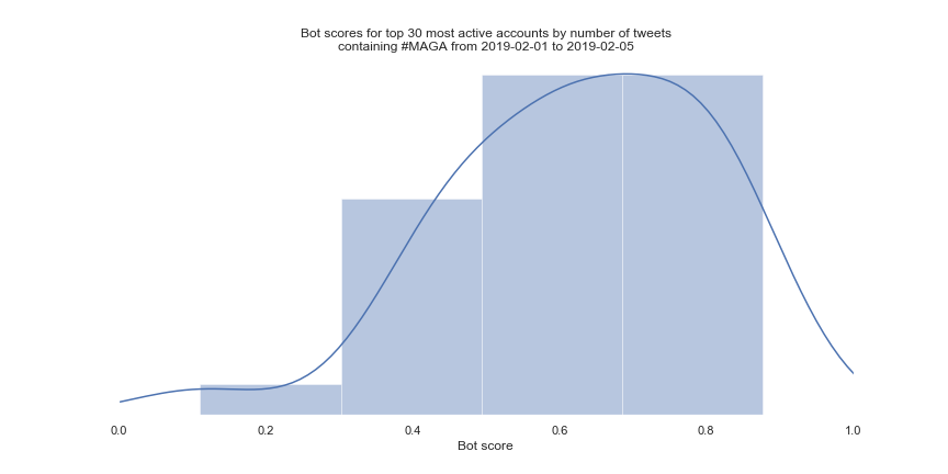
From this data I was able to identify bot-like accounts leading the charge by tweeting real seeming tweets. Many of them had huge amounts of followers and were using the hashtag hundreds of times in short time periods.

Through these bot-detection pipelines we are now able to monitor elections for interference from profit-seeking entities, state-actors, and skilled ideologues.
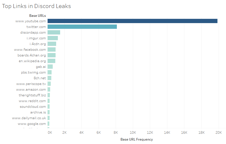
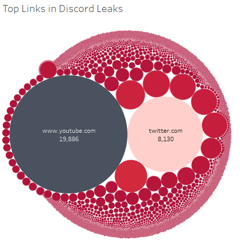
As seen in the Auckland University press The Big Q! In my study of hate groups I utilized the Discord Leaks of over 1 million messages from white-supremacist forums provided by Unicorn Riots to look at their information ecosystem. To do this I wrote a program that extracted all the links from each message and then added them all up.
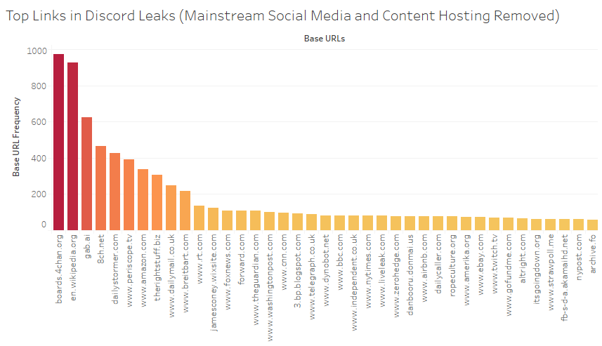
Using this technique I am able to start to understand the cross-forum ecosystem driving modern white nationalist terrorism.
A common facet of the modern internet is information warfare. This can take the form of disinformation campaigns or misinformation through things like conspiracy theories and rumors.